
Contents
Why Reusable Modal Component?
Reusable components are essential in ReactJS because they allow you to build pieces of your user interface that can be easily used again in different parts of your application. Instead of creating the same UI elements multiple times, you can make a component and use it wherever needed.
This not only saves time but also makes your code more manageable and efficient. If you need to make a change to a specific UI element, you only have to do it in one place (the component), and it automatically reflects across your application wherever that component is used. In simple terms, reusable components make your React code cleaner, more organized, and easier to maintain.
A reusable modal component is like a ready-made tool that developers can use across different parts of a website without starting from square one each time. It’s like having a versatile pop-up template that can be easily customized for various needs. This not only saves time for developers but also ensures a consistent and polished look for modals throughout the entire website. So, creating these reusable components is a smart move for a more efficient and visually cohesive user interface.
Let’s dive in and create a reusable modal with a slide-in animation using ReactJS and CSS. We’ll break it down into easy steps, making it accessible even for those new to web development.
Creating the Modal Component
In your React project folder, go to the “src” directory. Inside “src,” make a new folder named “components.” Within this folder, create a new JavaScript file and name it “Modal.js.”
const Modal = ({ show, onClose, title, children }) => {
const modalClassName = show ? 'modal show' : 'modal'; // Add 'show' class when modal is displayed
return (
<div className={modalClassName}>
<div className="modal-content">
<div className="modal-header">
<h2 className="modal-title">{title}</h2>
<button type="button" className="close" onClick={onClose}>
×
</button>
</div>
<div className="modal-body">{children}</div>
<div className="modal-footer">
<button type="button" className="btn btn-primary" onClick={onClose}>
Close
</button>
</div>
</div>
</div>
);
};
export default Modal;
This is where you’ll define the structure and behavior of your modal.
- Modal Component:
- This is the main component representing the entire modal.
- It takes several props (
show,onClose,title,children) to control its appearance, handle closing, and display dynamic content.
- Modal Header:
- Contains the title of the modal and a close button.
- The title (
{title}) is dynamic and can be customized based on the use case. - The close button (
×) triggers theonClosefunction, allowing users to close the modal.
- Modal Body:
- Houses the main content of the modal, which is passed as children (
{children}). - This part is dynamic and can include any content the developer wants to display within the modal.
- Houses the main content of the modal, which is passed as children (
- Modal Footer:
- Typically includes buttons or actions related to the modal.
- In this example, there’s a “Close” button that also triggers the
onClosefunction.
Understanding these components helps developers customize the modal’s appearance and behavior based on specific project requirements.
Styling the Modal
Now, let’s add some CSS to make our modal look appealing. Create a new CSS file in the same “components” folder and name it “Modal.css.”
/* Modal Styles */
body{
	background-color: rgb(10, 10, 54);
}

.modal {
	position: fixed;
	top: 0;
	left: -100%; /* Start off-screen to the left */
	width: 100%;
	height: 100%;
	display: flex;
	justify-content: center;
	align-items: center;
	z-index: 1000;
	opacity: 0;
	pointer-events: none;
	transition: left 0.3s ease-in-out, opacity 0.3s ease-in-out; /* Add a transition for left and opacity */
  }

  .modal.show {
	left: 0; /* Slide in from the left when shown */
	opacity: 1;
	pointer-events: auto;
  }

  .modal-content {
	background-color: white;
	padding: 20px;
	box-shadow: 0 2px 4px rgba(0, 0, 0, 0.2);
	border-radius: 15px;
  }

  /* Modal Header */
  .modal-header {
	display: flex;
	justify-content: space-between;
	align-items: center;
	border-bottom: 1px solid #ccc;
  }

  .modal-title {
	font-size: 24px;
	font-weight: bold;
  }

  .close {
	font-size: 30px;
	cursor: pointer;
	background-color: transparent;
	border: none
  }

  /* Modal Body */
  .modal-body {
	padding: 20px 0;
  }

  /* Modal Footer */
  .modal-footer {
	text-align: right;
  }

  .btn-primary {
	background-color: #007bff;
	color: #fff;
	border: none;
	padding: 10px 20px;
	border-radius: 5px;
	cursor: pointer;
  }

  .btn-primary:hover {
	background-color: #0056b3;
  }
Remember to link this CSS file to your “Modal.js” component.
Explanation:
- Background Color:
- The background color of the entire page is set to a deep blue (#0a0a36), creating a visually cohesive environment.
- Modal Styling:
- The modal is initially positioned off-screen (
left: -100%) and becomes visible with a sliding animation when theshowclass is applied.
- The modal is initially positioned off-screen (
- Modal Content Styling:
- The modal content has a white background, subtle box shadow, and rounded corners for a clean and modern appearance.
- Modal Header Styling:
- The header includes a bottom border for separation, and the title has an increased font size and bold style for prominence.
- Close Button Styling:
- The close button is styled with a larger size, cursor pointer, and a transparent background for a subtle and accessible design.
- Modal Body Styling:
- Padding is added to the modal body for better spacing and visual appeal.
- Modal Footer Styling:
- Content in the modal footer is aligned to the right for a neat presentation.
- Primary Button Styling:
- The primary button has a distinctive blue color, white text, padding, and border radius for a button-like appearance.
- Hover Effect:
- The primary button changes its background color on hover, providing a visual indication of interactivity.
How to use the Reusable Modal
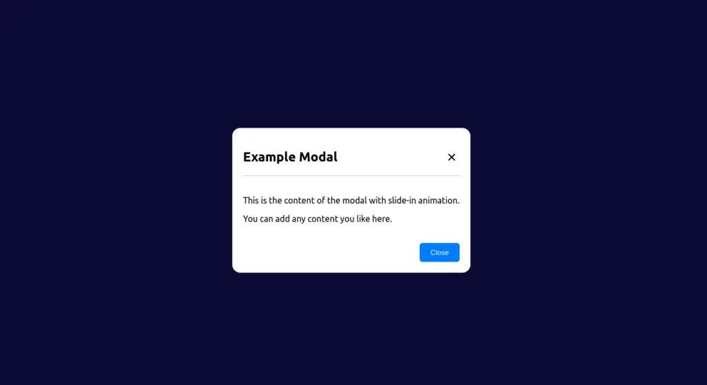
function App() {
  const [showModal, setShowModal] = useState(false);

  const openModal = () => {
    setShowModal(true);
  };

  const closeModal = () => {
    setShowModal(false);
  };

  return (
    <div>
      <button onClick={openModal}>Open Modal</button>
      <Modal
        show={showModal}
        onClose={closeModal}
        title="Example Modal"
      >
        <p>This is the content of the modal with slide-in animation.</p>
        <p>You can add any content you like here.</p>
      </Modal>
    </div>
  );
}


export default App;
Conclusion
In this article, we’ve explored the world of modals in web development, learned how to create a reusable modal component using ReactJS and CSS slide-in animation.


0 Comments