
Contents
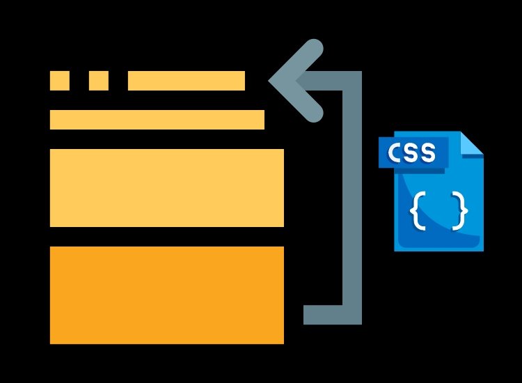
Reorder List Items with CSS
CSS (Cascading Style Sheets) is a powerful tool that allows web developers to control the presentation and layout of HTML elements.
One interesting feature of CSS is the ability to change the order of list items without modifying the HTML structure. In this blog post, we will explore different CSS techniques to reorder list items and provide code examples to help you implement them in your projects.
Method 1: to Reorder List Items: Using Flexbox
Flexbox is a layout module in CSS that provides a flexible way to distribute space among elements. It allows us to change the order of elements without modifying the HTML structure.
Here’s an example of how you can use flexbox to change the order of list items:
ul {
  display: flex;
  flex-direction: column;
}

li:nth-child(2) {
  order: 1;
}

li:nth-child(3) {
  order: 2;
}

li:nth-child(1) {
  order: 3;
}
In this example, we set the display property of the <ul> element to flex and the flex-direction property to column to display the list items vertically.
By using the order property on each <li> element, we can specify the desired order. In this case, the second <li> item will appear first, followed by the third item, and finally, the first item.
Flexbox explained
Flexbox, short for “Flexible Box,” is a layout model in CSS that allows you to design complex layouts with a more efficient and predictable way of distributing space and aligning items within a container.
Flexbox is particularly useful for creating one-dimensional layouts, such as rows or columns, and it excels at distributing available space among a set of elements. It’s especially valuable for responsive web design and for handling various screen sizes and orientations.
Here are some key concepts and features of Flexbox:
Flex Container: The parent element that contains the flex items is known as the flex container. To create a flex container, you need to set its display property to flex or inline-flex.
Flex Items: The children of the flex container are called flex items. These are the elements that you want to arrange within the container.
Main Axis and Cross Axis: In a flex container, there are two axes: the main axis and the cross axis. The main axis is defined by the flex-direction property, which can be set to row, row-reverse, column, or column-reverse. The cross axis is perpendicular to the main axis.
Flex Properties: Flex items can have various properties that control their behavior within the flex container. The most commonly used properties include:
flex-grow: Determines how much a flex item can grow when there’s available space.flex-shrink: Controls how much a flex item can shrink when there’s a lack of space.flex-basis: Specifies the initial size of the item before the remaining space is distributed.flex: A shorthand property for settingflex-grow,flex-shrink, andflex-basistogether.order: Defines the order in which items are displayed.
Alignment: Flexbox provides powerful tools for aligning flex items along the main and cross axes using properties like justify-content, align-items, and align-self.
Spacing: You can control the space between flex items using properties such as justify-content, align-content, and gap.
The advantages of using Flexbox include:
- Efficiency: Flexbox simplifies complex layout scenarios, reducing the need for hacks and workarounds commonly used with traditional CSS layouts.
- Responsive Design: It makes it easier to create responsive designs because flex items can adapt to different screen sizes and orientations.
- Self-adjusting: Flex items can automatically adjust their sizes and positions to fill the available space, making it easier to create adaptive and dynamic layouts.
- Intuitive: The Flexbox model is easier to understand and reason about, making it more developer-friendly.
However, it’s essential to note that Flexbox is best suited for one-dimensional layouts. For more complex two-dimensional layouts, CSS Grid Layout is often a better choice. CSS Grid Layout and Flexbox can also be used together for comprehensive layout solutions in web design.
Method 2: to Reorder List Items: Using CSS Grid
CSS Grid is a powerful layout system that allows you to create complex grid-based layouts with ease. It also provides the ability to change the order of grid items. Here’s an example of how you can use CSS Grid to change the order of list items:
ul {
  display: grid;
  grid-template-columns: 1fr;
  grid-template-rows: repeat(3, auto);
  grid-auto-flow: column;
}

li:nth-child(2) {
  order: 1;
}

li:nth-child(3) {
  order: 2;
}

li:nth-child(1) {
  order: 3;
}
In this example, we set the display property of the <ul> element to grid. By specifying the grid-template-columns and grid-template-rows, we create a grid with a single column and three rows. The grid-auto-flow property is set to column to arrange the items in a column-wise manner. Again, we use the order property to change the order of list items.
CSS Grid Explained
CSS Grid Layout, commonly referred to as CSS Grid, is a two-dimensional layout system in CSS that allows you to create grid-based layouts for web pages. Unlike Flexbox, which is primarily designed for one-dimensional layouts, CSS Grid is ideal for both rows and columns, making it a powerful tool for building complex, grid-based designs.
Key features and concepts of CSS Grid include:
- Grid Container: The HTML element serving as the container for the grid is referred to as the grid container. To define an element as a grid container, you set its
displayproperty togrid. - Grid Items: The children of the grid container are known as grid items. These are the elements you want to place within the grid.
- Grid Lines: Grid lines are the horizontal and vertical dividing lines that form the grid. You can reference these lines to position grid items or define the grid structure.
- Grid Rows and Columns: You can specify the number and size of rows and columns in the grid using properties like
grid-template-rows,grid-template-columns, andgrid-template-areas. These properties allow you to create flexible grid structures. - Grid Gaps: You can set the spacing between rows and columns using properties like
grid-gaporgrid-row-gapandgrid-column-gap. - Grid Lines and Areas Naming: You can give names to grid lines and areas to make the code more readable and maintainable, especially when dealing with complex layouts.
- Grid Placement: CSS Grid provides various properties like
grid-row,grid-column,grid-row-start,grid-row-end,grid-column-start, andgrid-column-endfor precisely placing grid items within the grid. - Grid Template Areas: This feature allows you to define a grid structure using named grid areas. You can place items within these areas using their names.
- Auto Placement: CSS Grid can automatically place grid items in the grid without specifying their positions explicitly. This is useful when you want to create responsive layouts that adapt to available space.
- Alignment: Grid items can be aligned both horizontally and vertically using properties like
justify-items,align-items,justify-self, andalign-self.
Benefits of using CSS Grid include:
- Two-Dimensional Layouts: CSS Grid is designed for complex two-dimensional layouts, which are challenging to achieve using other CSS layout models.
- Responsive Design: It makes responsive design easier, as you can create layouts that adapt to various screen sizes and orientations.
- Precise Control: CSS Grid provides fine-grained control over the placement and sizing of grid items, which is especially useful for creating intricate designs.
- Reduced HTML Structure: It reduces the need for excessive HTML elements or classes to achieve the desired layout, resulting in cleaner and more semantic code.
While CSS Grid is powerful and flexible, it may not be the best choice for all layout scenarios. In some cases, it’s beneficial to combine CSS Grid with other layout models like Flexbox for optimal results. CSS Grid and Flexbox are complementary tools that can be used together to achieve complex, responsive designs.
Method 3: to Reorder List Items: Using CSS Flexbox and Order Property
If you want to retain the default HTML list structure and still change the order of list items, you can use CSS Flexbox along with the order property. Here’s an example:
ul {
  display: flex;
  flex-direction: column;
}

li {
  order: 9999;
}

li:nth-child(2) {
  order: 1;
}

li:nth-child(3) {
  order: 2;
}

li:nth-child(1) {
  order: 3;
}
In this approach, we set the display property of the <ul> element to flex and the flex-direction property to column. By default, all list items have the same order value (in this case, 9999), which ensures they retain their original order. By assigning lower order values to specific list items using the nth-child selector, we can change their order.
Conclusion
Changing the order of list items using CSS is a powerful technique that allows you to customize the visual representation of your HTML lists without modifying the underlying structure. Whether you prefer using Flexbox, CSS Grid, or a combination of Flexbox and the order property, CSS provides several methods to achieve this effect. Experiment with these techniques and choose the one that best suits your needs. Happy coding!


0 Comments