
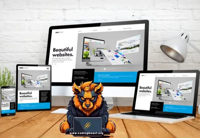
One of the must haves in today’s digital age is creating a website that is responsive and adaptive to different screen sizes. There for it’s essential that your website provides a seamless experience across all kind devices, mobile phones, tablets, computers etc. Fortunately, CSS media queries make it possible to create responsive websites that adapt to different screen sizes. In this article, we’ll explore how to use media queries to create a responsive website.
Contents
What are Media Queries?
The CSS media queries are a way to apply CSS styles based on the size of the device that a website is being viewed on. With media queries, you can create different styles for different screen sizes, which allows your website to be responsive and adapt to different devices.
Media queries work by specifying a set of CSS rules that apply only when certain conditions are met. These conditions can be based on the width and height of the screen, the device orientation, and the pixel density of the screen.
Syntax of Media Queries
The syntax of media queries is as follows:
@media screen and (max-width: 700px) {
  /* CSS styles for screens smaller than or equal to 700px */
}

@media screen and (min-width: 700px) and (max-width: 1000px) {
  /* CSS styles for screens between 700px and 1000px */
}

@media screen and (min-width: 1000px) {
  /* CSS styles for screens larger than or equal to 1000px */
}
In the css code example stated above, we have defined three media queries based on the screen size.
- The first media query applies styles for screens smaller than or equal to 700px.
- The second media query applies styles for screens between 700px and 1000px.
- And the third media query applies styles for screens larger than or equal to 1000px.
Creating Responsive Layouts with Media Queries
The use of media queries is to create responsive layouts. By using media queries, you can adjust the layout of your website based on the screen size. For example, you may want to display a two-column layout on desktop devices but switch to a one-column layout on mobile devices.
Here’s an example of a responsive layout using media queries:
/* Default styles for all screen sizes */
.container {
  display: flex;
  flex-direction: row;
}

.item {
  flex: 1;
  padding: 10px;
}

/* Media query for screens smaller than or equal to 700px */
@media screen and (max-width: 700px) {
  .container {
    flex-direction: column;
  }
}
In the media query example from, we have defined a flexbox layout with two columns. On screens smaller than or equal to 700px, we have used a media query to change the flex-direction to column, which switches the layout to a single column.
Optimizing Images with Media Queries
By using media queries, you can load smaller images for mobile devices. Optimizing images for different screen sizes is another common use of media queries. This reduces the page load time and improves the user experience.
Here’s an example of how to use media queries to optimize images:
/* Default styles for all screen sizes */
.image {
   background-image: url('image.png');
   background-size: cover;
}

/* Media query for screens smaller than or equal to 700px */
@media screen and (max-width: 700px) {
.image {
   background-image: url('image-mobile.png');
 }
}
In the above example, we have defined a background image names image.png for all screen sizes and for smaller or equal screens sizes than 700px, we have used a media query to load a smaller image called "image-mobile.png";.
This will improving the user experience by loading faster on mobile devices.
Using Media Queries for Typography
Media queries can also be used to adjust typography for different screen sizes. By using media queries, you can adjust font sizes, line heights, and letter spacing based on the screen size.
Here’s an example of how to use media queries for typography:
/* Default styles for all screen sizes */
h1 {
  font-size: 2rem;
  line-height: 1.5;
  letter-spacing: 0.5px;
}

/* Media query for screens smaller than or equal to 700px */
@media screen and (max-width: 700px) {
  h1 {
    font-size: 1.5rem;
    line-height: 1.2;
    letter-spacing: 0.3px;
  }
}
In the above example, we have defined a font size, line height, and letter spacing for all screen sizes, but we have added a media query for screens smaller than or equal to 700px, to adjust the font size, line height, and letter spacing to be more readable on smaller screens.
Main types of media queries based on screen width:
min-width: This type of media query applies styles when the screen width is equal to or greater than a specified value. For example, @media (min-width: 700px) applies styles when the screen width is 700 pixels or wider. This is commonly used to create styles for tablets and desktops.
max-width: This type of media query applies styles when the screen width is less than or equal to a specified value. For example, @media (max-width: 699px) applies styles when the screen width is 699 pixels or narrower. This is commonly used to create styles for smartphones.
min-width and max-width: These types of media queries apply styles when the screen width is within a specific range. For example, @media (min-width: 700px) and (max-width: 1000px) applies styles when the screen width is between 700 pixels and 1000 pixels. This is commonly used to create styles for tablets.
orientation: This type of media query applies styles based on the orientation of the device, either portrait or landscape. For example, @media (orientation: portrait) applies styles when the device is in portrait orientation.
By using combinations of these media queries, developers can create highly specific styles for different screen sizes and orientations. For example, a website may use a min-width media query to adjust the layout for tablets, a max-width media query to adjust the layout for smartphones, and an orientation media query to adjust the layout for landscape vs. portrait orientation.
Conclusion
CSS media queries are a powerful tool for creating responsive websites that adapt to different screen sizes. By using media queries, you can create different styles for different screen sizes, adjust the layout of your website, optimize images, and adjust typography. With these tips, you can master media queries and create a website that provides a seamless experience across all devices.


Thanks for sharing. I read many of your blog posts, cool, your blog is very good.