
In today’s world creating a responsive website is essential. With the increasing use of mobile devices to access the internet, it’s become essential to ensure that your website is optimized for all screen sizes and devices. Responsive web design allows your website to adapt to different screen sizes and resolutions, providing a seamless user experience on all devices. Now let’s dive into the 10 tips for creating a responsive website with HTML and CSS.
Contents
Use Media Queries
With the use of media queries we are able to target specific screen sizes and resolutions and apply CSS styles accordingly. We can use media queries to change the font size, layout, or image size, depending on the device’s screen size. Media queries are essential for creating a responsive website, and you should learn how to use them effectively. We will dive deeper in media queries in some of our blog posts.
Use a Responsive Framework
The easiest way to achieve responsive website is by using a responsive framework. Bootstrap and Foundation are one of the popular frameworks. They provide pre-built CSS classes that allow you to create a responsive layout quickly. These frameworks come with pre-built components such as navigation bars, buttons, and forms, which can be easily customized to fit your website’s design.
Optimize Images
Images are a crucial part of any website, but they can also slow down your website’s loading time, especially on mobile devices. To ensure that your website is optimized for all devices, you should optimize your images for the web. You can use tools like Photoshop or online tools like TinyPNG to compress your images without losing quality.
Use Relative Units
We should prioritize using relative units like ems, rems, and percentages. They allows your website to adjust to different screen sizes and resolutions. Avoid using fixed units like pixels, which can make your website look distorted on different devices.
Keep Your Code Clean
Prioritize keeping your HTML and CSS code clean and organized. This can help you avoid errors and make it easier to maintain your website. Use proper indentation, comment your code, and use meaningful class names to make your code more readable.
Use SVG Graphics
Using SVG graphics instead of PNG or JPEG images can help you create salable graphics that look great on all screen sizes and resolutions. SVG graphics are vector-based, which means they can be scaled without losing quality.
Use Flexbox
Using the layout module Flexbox which is a CSS that allows you to create flexible and responsive layouts with ease. Flexbox provides a set of CSS properties that allow you to control the alignment, direction, and order of your HTML elements.
Avoid Using Flash
Avoid using Flash on your website as it’s not supported on most mobile devices. Instead, use HTML5 and CSS3 to create animations and effects on your website.
Keep Your Website Simple
Keeping your website simple and clutter-free can help you create a better user experience. Avoid using too many images, animations, and effects that can slow down your website’s loading time. Focus on creating a clean and straightforward design that looks good on all devices.
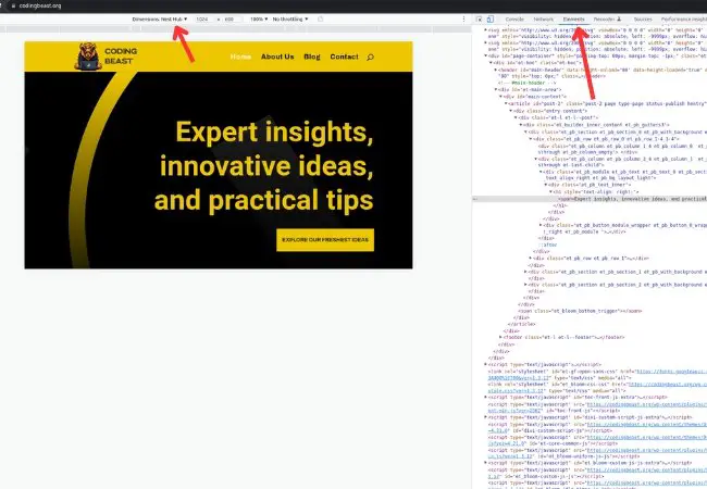
Test Your Website on Different Devices
To make sure that the website is responsive it is crucial that you test it on different devices. This is essential to ensure that it looks good and functions correctly on all devices. You can use tools like BrowserStack or CrossBrowserTesting to test your website on different devices and browsers, or the simplest way to test responsiveness is to use the browser’s built-in developer tools that allow you to test the responsiveness of a website. To do the testing from the builtin developer tools you should right-click anywhere on the website and select “Inspect” or “Inspect Element.” This will open the developer tools panel.
In the developer tools panel, click on the device icon (usually located at the top left corner) to open the device toolbar. From here, you can select the device you want to test your website on, or you can create a custom device size. The device toolbar will resize the website to fit the selected device size, allowing you to test the responsiveness of the website.
Conclusion
In conclusion, creating a responsive website with HTML and CSS is essential to provide a seamless user experience on all devices. By following these ten tips, you can create a responsive website that looks great and functions correctly on all screen sizes and resolutions. Remember to test your website on different devices, optimize your images, and use relative units and media queries to create a flexible and adaptive layout.


0 Comments