
Contents
How to Create Reusable Grid Component with Sort Functionality
Creating a reusable grid component in React can be a valuable addition to your web development toolkit.
Below is an example of a simple reusable grid component that you can use as a starting point for your projects. This grid component will allow you to display tabular data with sorting capabilities.
import React, { useState } from 'react';

const Grid = ({ data, columns }) => {
  const [sortColumn, setSortColumn] = useState(null);
  const [sortDirection, setSortDirection] = useState('asc');

  const handleSort = (column) => {
    if (sortColumn === column) {
      // Toggle the sorting direction
      setSortDirection(sortDirection === 'asc' ? 'desc' : 'asc');
    } else {
      setSortColumn(column);
      setSortDirection('asc');
    }
  };

  const sortedData = [...data];

  if (sortColumn) {
    sortedData.sort((a, b) => {
      const aValue = a[sortColumn];
      const bValue = b[sortColumn];
      if (aValue < bValue) return sortDirection === 'asc' ? -1 : 1;
      if (aValue > bValue) return sortDirection === 'asc' ? 1 : -1;
      return 0;
    });
  }

  return (
    <table>
      <thead>
        <tr>
          {columns.map((column, index) => (
            <th
              key={index}
              onClick={() => handleSort(column)}
              style={{ cursor: 'pointer' }}
            >
              {column}
              {sortColumn === column && (
                <span>{sortDirection === 'asc' ? ' ▲' : ' ▼'}</span>
              )}
            </th>
          ))}
        </tr>
      </thead>
      <tbody>
        {sortedData.map((item, rowIndex) => (
          <tr key={rowIndex}>
            {columns.map((column, colIndex) => (
              <td key={colIndex}>{item[column]}</td>
            ))}
          </tr>
        ))}
      </tbody>
    </table>
  );
};

export default Grid;
- This reusable grid component accepts two props:
dataandcolumns, which represent the data to be displayed and the column names for the grid. - Inside the component, two pieces of state are managed using the
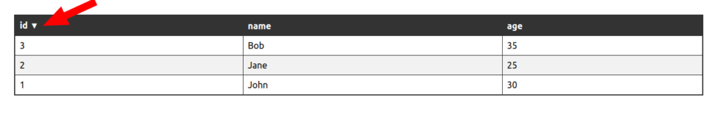
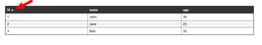
useStatehook.sortColumnrepresents the column currently being used for sorting, andsortDirectionstores the sorting direction, which is initially set to ascending (‘asc’). handleSortis a function that is called when a column header is clicked. It manages the sorting behavior of the grid. If the clicked column is the same as the currently sorted column, it toggles the sorting direction between ascending and descending. If it’s a different column, it updatessortColumnto the new column and sets the sorting direction to ascending.
sortedDatais a copy of the originaldataarray. IfsortColumnis set (i.e., there’s a column to sort by), it sortssortedDatabased on the selected column and sorting direction. It uses a comparison function to determine the sorting order.- The component returns a
tableelement, representing the grid. Inside thetheadelement, it maps over thecolumnsarray to create the column headers. Each column header is athelement and is set up with anonClickevent that calls thehandleSortfunction when clicked. Thecursorstyle is set to ‘pointer’ to indicate interactivity. If the column being sorted matches thesortColumn, an arrow (▲ for ascending, ▼ for descending) is displayed next to the column name. - Within the
tbody, the component maps oversortedDatato create the rows and cells of the grid. It iterates through each item in the data and displays the values in the corresponding columns.
Here’s how to use this Grid component in your application:
- Create an array of data and an array of column names:
const data = [
  { id: 1, name: 'John', age: 30 },
  { id: 2, name: 'Jane', age: 25 },
  { id: 3, name: 'Bob', age: 35 },
];

const columns = ['id', 'name', 'age'];
- Use the
Gridcomponent in your application:
import React from 'react';
import Grid from './Grid';
function App() {
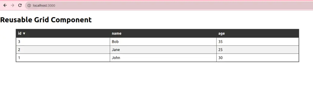
return (
<div>
<h1>Reusable Grid Component</h1>
<Grid data={data} columns={columns} />
</div>
);
}
export default App;
This code will render a table with sortable columns for the data you provide.
You can customize the columns array to display the specific columns you want and provide the data accordingly.
You can further enhance this component by adding features like pagination, filtering, or additional customization options to suit your specific project requirements.
Style the Reusable Grid Component
To create a CSS style for your grid with highlighted column headers and grid lines, you can apply some CSS to the Grid component. Below is an example of a CSS stylesheet that will style your grid as requested:
/* Grid.css (or any other CSS file) */
table {
  width: 100%;
  border-collapse: collapse;
  border: 2px solid #333; /* Add grid border */
}

th {
  background-color: #333; /* Header background color */
  color: #fff; /* Header text color */
  text-align: left;
  padding: 10px;
  cursor: pointer;
}

th:hover {
  background-color: #555; /* Highlight on hover */
}

td, th {
  border: 1px solid #333; /* Add grid lines to cells */
  padding: 8px;
}

tr:nth-child(even) {
  background-color: #f2f2f2; /* Alternate row background color */
}

tr:hover {
  background-color: #ddd; /* Highlight on row hover */
}
Conclusion
Creating reusable components in web development is a fundamental practice that offers numerous advantages.
The creation of a reusable grid component, as demonstrated, illustrates the power of this approach. By encapsulating grid functionality and styling within a reusable component, developers can streamline their code, enhance maintainability, and improve the overall consistency of their web applications.
This approach not only reduces redundancy but also promotes modular and efficient development.
Reusable grid components can be easily integrated into various projects, facilitating consistent user experiences, and saving time in the long run.
The ability to create flexible, customized grids with interactive features and stylish design not only enhances the user interface but also greatly simplifies the development process, making it an essential tool for building sophisticated and efficient web applications.


0 Comments