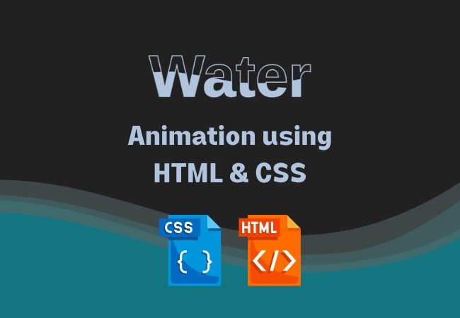
In this blog post, we explore the fascinating world CSS & HTML water animation. We’ll dive into the code and break down how to create an engaging water animation effect using CSS. By combining key CSS properties and animation techniques, we’ll bring a sense of fluidity and movement to the screen. Whether you’re a beginner or an experienced developer, this tutorial will provide you with the knowledge and inspiration to add captivating weather animations to your web projects. Join us as we uncover the secrets behind this mesmerizing water animation and learn how to apply it to your own HTML and CSS creations.
Create water animation using CSS & HTML
<!DOCTYPE html>
<html>

<head>
    <link rel="stylesheet" href="index.css">
</head>

<body>
    <div class="content">
        <h2>Water</h2>
        <h2>Water</h2>
    </div>
</body>

</html>
*{
    margin: 0;
    padding: 0;
    box-sizing: border-box;
    font-family: sans-serif;
}

body{
    display: flex;
    justify-content: center;
    align-items: center;
    background-color: #212121;
}

.content{
    position: relative;
}

.content h2{
    position: absolute;
    color: lightsteelblue;
    transform: translate(-50%, -50%);
    font-size: 8em;
}

.content h2:nth-child(1){
    color:transparent;
    -webkit-text-stroke: 2px lightsteelblue;
}

.content h2:nth-child(2){
    color:lightsteelblue;
    animation: animate 3s ease-in-out infinite;
}

@keyframes animate {
    0%, 100% {
        clip-path: polygon(0% 45%, 15% 44%, 32% 50%, 54% 60%, 70% 61%, 84% 59%, 100% 52%, 100% 100%, 0% 100%);
    }
    50% {
        clip-path: polygon(0% 60%, 16% 65%, 34% 66%, 51% 62%, 67% 50%, 84% 45%, 100% 46%, 100% 100%, 0% 100%);
    }
}
CSS code explained
Here’s a brief explanation of the purpose and significance of each key CSS property used in the animation:
*{ margin: 0; padding: 0; box-sizing: border-box; font-family: sans-serif; }- Purpose: Sets global CSS rules for all elements on the page.
- Significance:
margin: 0; padding: 0;: Resets margin and padding to remove default spacing.box-sizing: border-box;: Ensures that the declared width and height of an element include padding and border.font-family: sans-serif;: Sets the default font family to sans-serif for all elements.
body{ display: flex; justify-content: center; align-items: center; background-color: #212121; }- Purpose: Styles the body element.
- Significance:
display: flex;: Enables flexbox layout for the body.justify-content: center; align-items: center;: Centers the content both horizontally and vertically.background-color: #212121;: Sets the background color of the body to dark gray.
.content{ position: relative; }- Purpose: Styles a container div with the class ‘content.’
- Significance:
position: relative;: Positions the div relative to its normal position.
.content h2{ position: absolute; color: lightsteelblue; transform: translate(-50%, -50%); font-size: 8em; }- Purpose: Styles the heading elements inside the ‘content’ div.
- Significance:
position: absolute;: Positions the headings absolutely within the content div.color: lightsteelblue;: Sets the color of the headings to lightsteelblue.transform: translate(-50%, -50%);: Centers the headings both vertically and horizontally using a transform.font-size: 8em;: Sets the font size of the headings to 8em (adjustable).
.content h2:nth-child(1){ color: transparent; -webkit-text-stroke: 2px lightsteelblue; }- Purpose: Selects the first heading element inside ‘content.’
- Significance:
color: transparent;: Makes the text transparent, creating an outline effect.-webkit-text-stroke: 2px lightsteelblue;: Adds a 2-pixel lightsteelblue stroke to the text.
.content h2:nth-child(2){ color: lightsteelblue; animation: animate 3s ease-in-out infinite; }- Purpose: Selects the second heading element inside ‘content.’
- Significance:
color: lightsteelblue;: Sets the color of the second heading to lightsteelblue.animation: animate 3s ease-in-out infinite;: Applies the ‘animate’ animation to the second heading with a duration of 3 seconds, ease-in-out timing function, and infinite repeat.
@keyframes animate { ... }- Purpose: Defines the keyframes for the ‘animate’ animation.
- Significance:
- Keyframes specify how the animation evolves over time.
- Two keyframes (0% and 50%) are defined to create a water-like animation using the
clip-pathproperty.
- Additional Explanation for
@keyframes animate:- 0%, 100% Keyframe:
- Defines the initial and final state of the animation.
- Uses
clip-pathto create a polygon shape outlining the water animation.
- 50% Keyframe:
- Defines the middle state of the animation.
- Alters the
clip-pathproperty to create a different polygon shape, simulating a wave-like appearance.
- Infinite Animation:
- The animation is set to repeat infinitely, creating a continuous water animation effect.
- 0%, 100% Keyframe:
These CSS properties collectively contribute to the creation of a visually appealing water animation on the web page. Adjustments to these properties can lead to variations in the animation’s appearance
Conclusion
When the HTML file is loaded in a browser and linked with the CSS file, the result is an animated water effect where the second heading appears to be flowing like water within a defined clip path. The first heading provides an outline stroke effect, enhancing the water-like appearance.


0 Comments